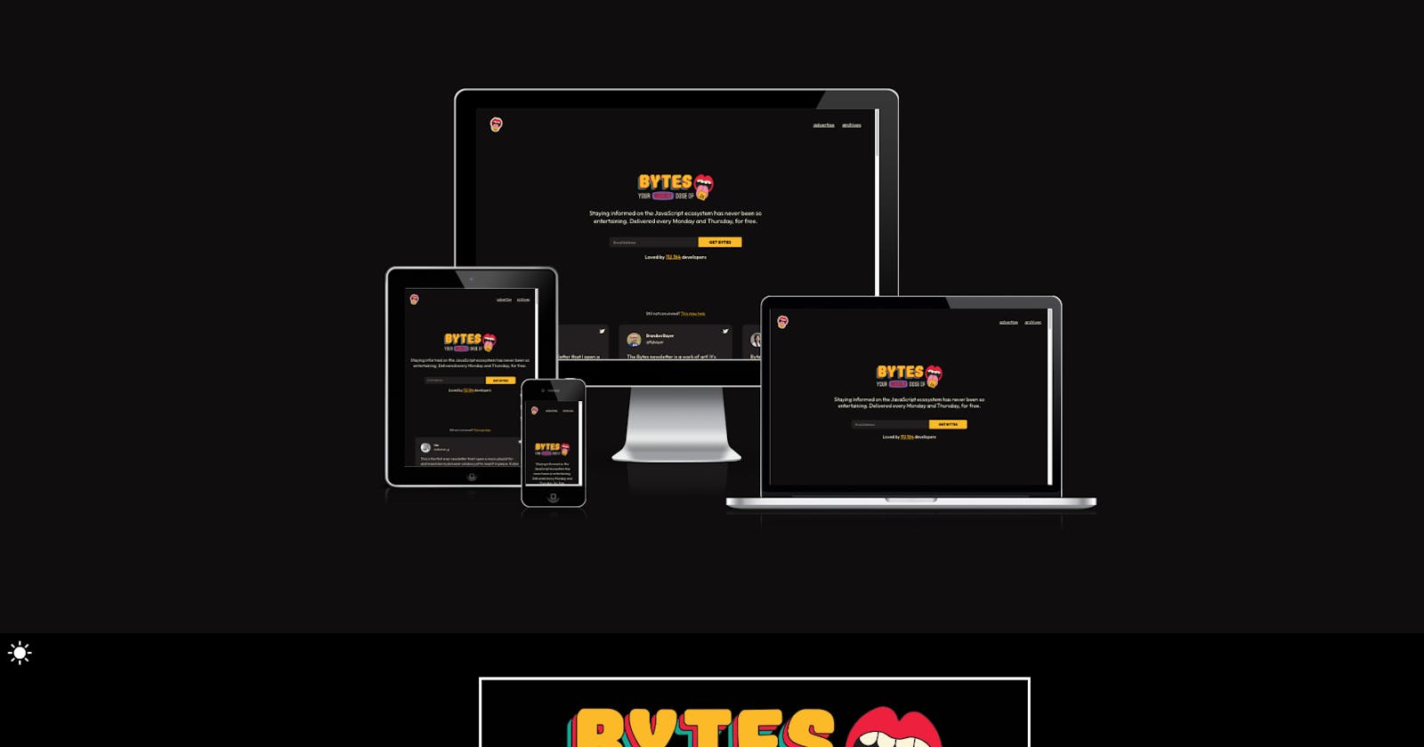
Have you always been changing the display size, the width or toggling de device bar to change between the wide range of different options available?
That time might be over with this website created by bytes.dev.
It’s super easy to use. You copy the url of the site, paste it and GO! That easy 😉
When your site is displayed you can even interact with each of the screens 🤯
Note that, as they say on their website, it is not a tool for testing, so if you need to test different devices, best way to do it is on the device itself (but at least to have an idea works perfect).
Hope you like it!
Salut, Jordi.
